Profitworx
Profitworx takes a bold approach to bringing clarity and measurable growth to ambitious businesses. Built to inspire confidence, communicate expertise, and grow alongside the consulting firm.
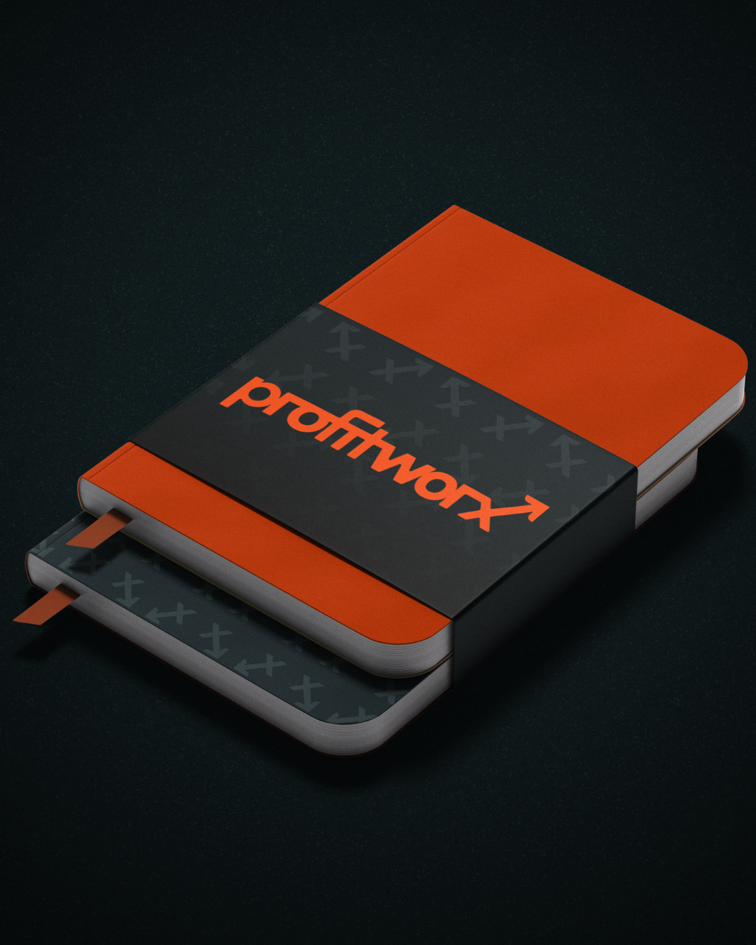
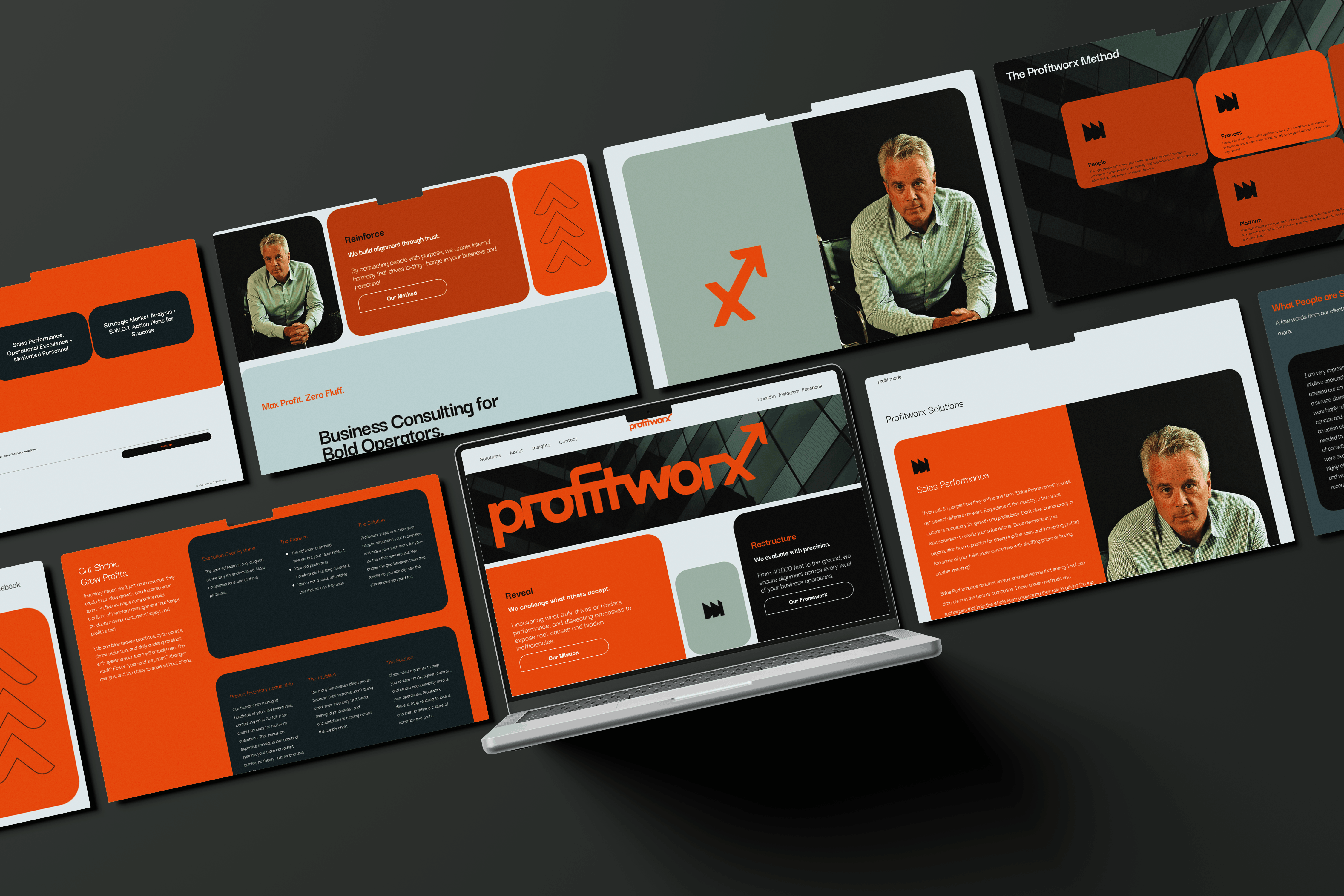
Developed a complete brand ecosystem including identity design, digital assets, and marketing materials designed to position Profitworx as a trusted strategic partner.

Client
Profitworx
Date
©
2025 - 2026
Services
Brand Strategy · Identity Design · Web Design



VIEW LIVE SITE ↗
Project Overview
Profitworx is a business consulting practice helping established owners gain greater financial clarity, strengthen operations, and build businesses positioned for sustainable growth.
Previously operating as Davis Profit Consulting, the firm had already built strong credibility in the Spokane-Coeur d’Alene region, working with respected local companies such as Kiemle Hagood and other established businesses. As client relationships deepened and the caliber of work expanded, the original identity no longer reflected the level of trust, sophistication, or strategic impact the firm was delivering.
The engagement began with a new name and developed into a complete visual identity, website, collateral, photography, and digital content system designed to match the authority the practice had already earned.
The Challenge
The original Davis Profit Consulting identity communicated the category, but not the caliber of the work.
A bar chart, oversized upward arrow, and traditional typography relied on familiar visual shorthand for profit and business growth. While immediately legible, the identity felt interchangeable within a consulting landscape already saturated with similar financial symbols, corporate blue palettes, and generic promises of improvement. This was especially limiting given the reality of the business: Davis Profit Consulting was already operating at a high level, advising established regional companies and trusted organizations. The brand, however, did not yet reflect that credibility or the nuance of its advisory role.
As the practice evolved into Profitworx, the challenge was not to “elevate” something early-stage, but to realign the identity with an already-proven consulting practice, retaining the idea of measurable progress without relying on overused financial imagery.
The new identity needed to feel credible enough for senior-level business consulting, distinctive enough to stand apart in a crowded regional market, and flexible enough to support continued growth beyond the Inland Northwest.
The Discovery
The original Davis Profit Consulting identity communicated the category, but little about the company itself.
A bar chart, oversized upward arrow, and traditional typography relied on familiar visual shorthand for profit and business growth. While understandable, the identity felt dated and interchangeable within a category already saturated with graphs, arrows, corporate blue, and broad promises of success.
Rather than discarding the upward arrow associated with the original brand entirely, the opportunity was to evolve it into something more proprietary. Instead of placing growth beside the company name as a symbol, growth could be embedded directly into the structure of the name itself.
The Identity System
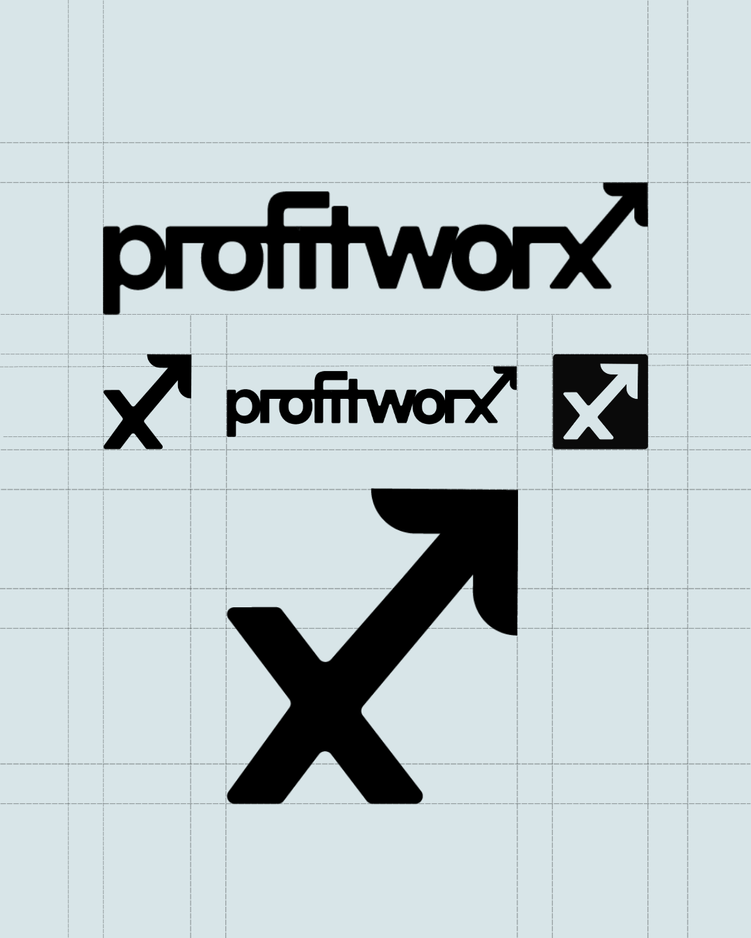
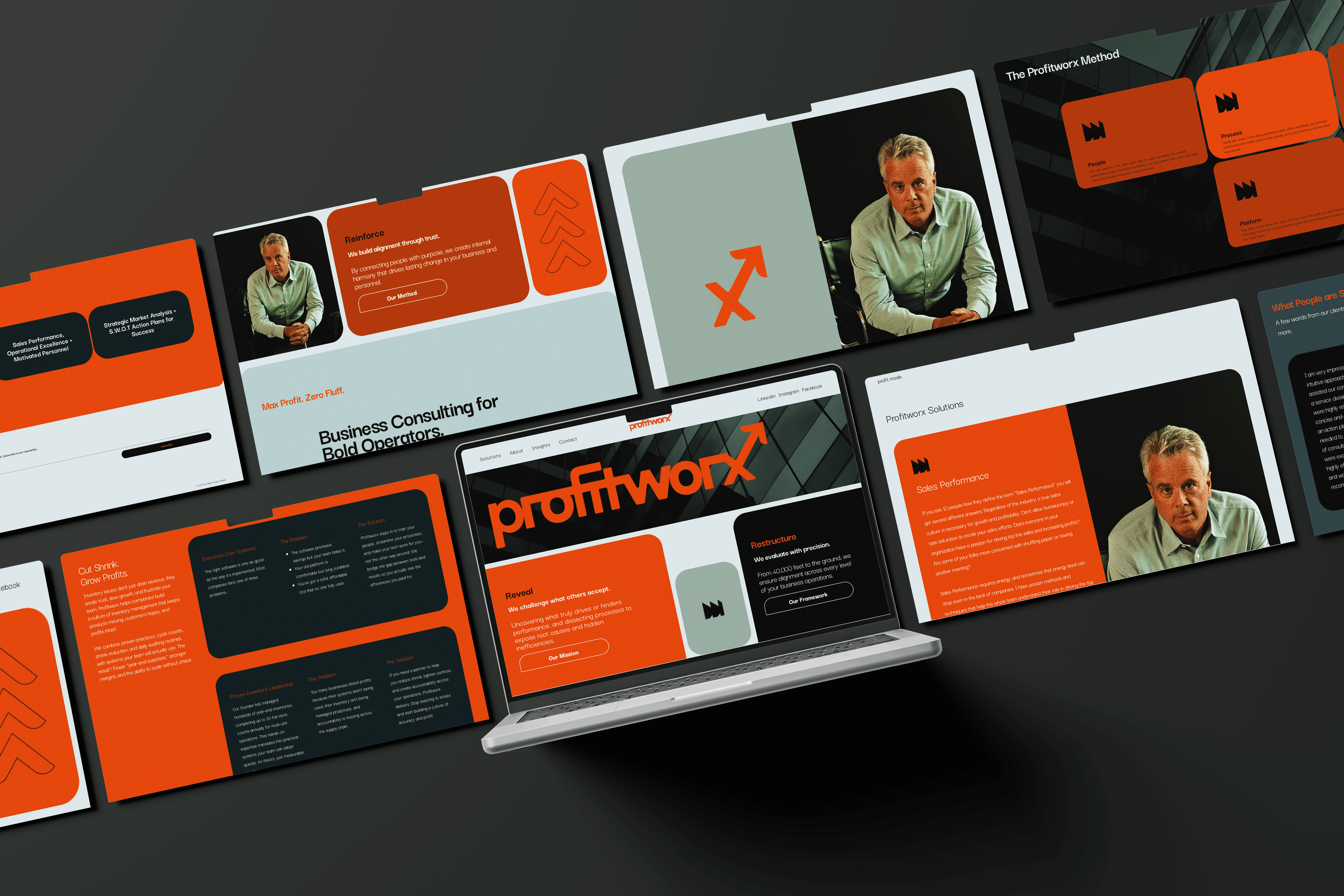
The Profitworx identity is built around a flexible family of marks derived from the central X-arrow concept.
The primary wordmark integrates the upward trajectory directly into the company name, while standalone and secondary marks allow the idea to operate independently across smaller applications. Repeating X forms and intersecting directional lines extend the concept into patterns and graphic compositions, creating consistency without requiring the logo to appear on every touchpoint.
A condensed typographic system keeps communication direct and confident, while the palette moves away from traditional financial-services blue toward deep slate and blue-gray tones punctuated by vivid orange.
The result balances two sides of the consultancy: the structure and credibility required for financial strategy with the energy and momentum associated with meaningful business change.


The Outcome
Profitworx emerged with a brand capable of fully supporting a consulting practice that was already operating at a high level.
The new identity transformed a literal financial-services logo into a cohesive visual system spanning brand identity, web design, collateral, photography, social content, and ongoing marketing applications.
By carrying forward the strongest conceptual equity from the original identity while removing its most generic execution, Profitworx gained a system that feels aligned with the caliber of clients it already serves without losing accessibility or regional authenticity.
More importantly, it gave the practice an ownable visual idea that matches its real-world credibility.
Growth is no longer represented by a stock chart or external symbol. It is embedded within the structure of the brand itself, creating a system designed around the same objective Profitworx brings to its clients: turn established success into clearer, more intentional forward movement.


.png)
Turning Expertise into Content
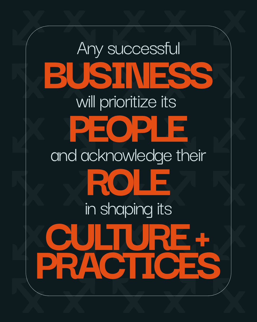
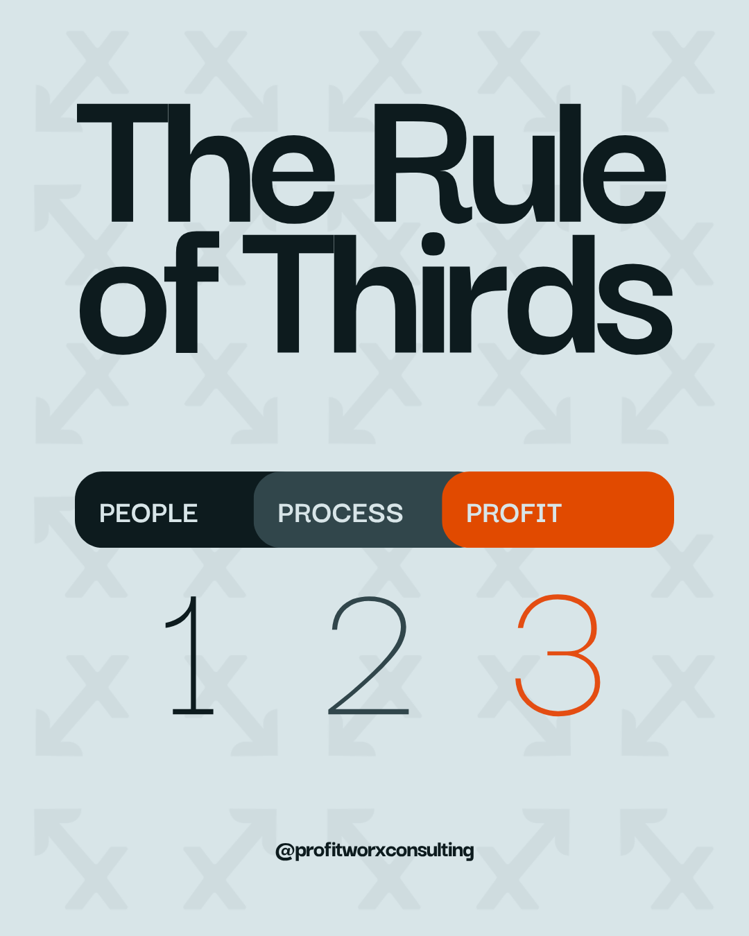
The identity was extended into an ongoing social system designed to translate complex business and financial topics into clear, accessible, and authoritative content.
A flexible social media framework was developed to support educational insights, financial analysis, operational thinking, service messaging, and thought leadership tailored to an audience of established business owners.
Strong typography, structured hierarchy, recurring X-based visual elements, and brand photography create consistency while allowing each topic to stand on its own merit.
The objective remains consistent with the broader identity: reduce complexity, reinforce clarity, and support better decision-making.






The Deliverables
- Brand strategy and positioning
- Naming and rebrand
- Visual identity
- Logo system
- Typography and color system
- Custom patterns and graphic language
- Website design
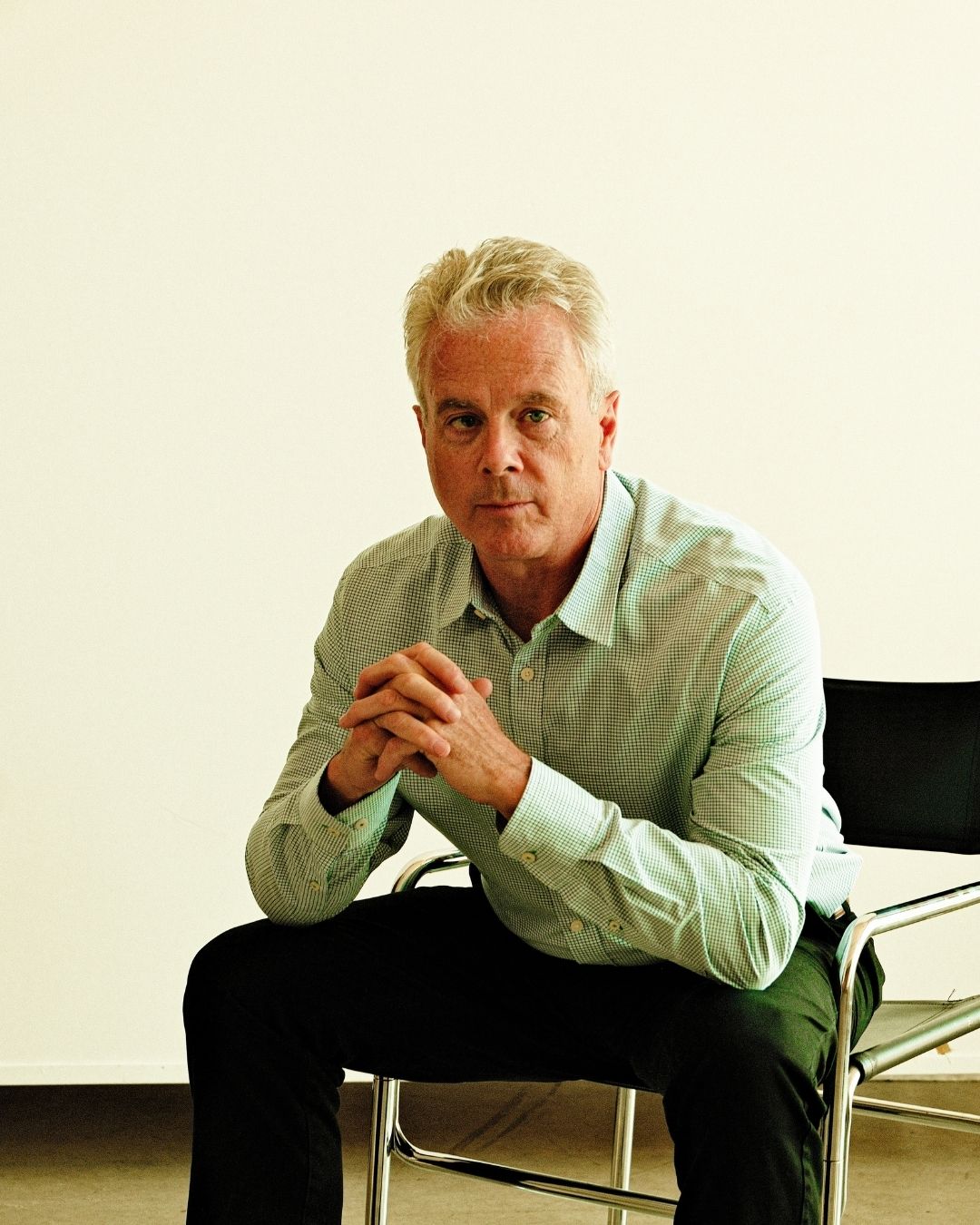
- Brand photography
- Brand videography
- Marketing collateral
- Social media art direction
- Social content system
- Digital and print applications

.jpg)

-3.jpg)
.png)



.jpg)