Renegade
Renegade is a speculative skate brand built around the ideas of post-internet disruption and conventional irreverence. The identity explores what happens when a brand system is designed to feel unstable, and slightly uncomfortable. Mixing aggressive typography, distressed imagery, layered graphics and raw production techniques into a visual language designed to be broken apart and rebuilt.

Client
Renegade
Date
©
2026
Services
Brand Identity · Apparel Design · Skateboard Design
The Concept
Skate culture has always existed between sport, inner-city subcultures, and self-expression. Renegade was created as an exploration of that tension. I intended for the identity and visual language of the brand to feel hyper-graphic, bold, confrontational, and slightly unpredictable.

The Identity
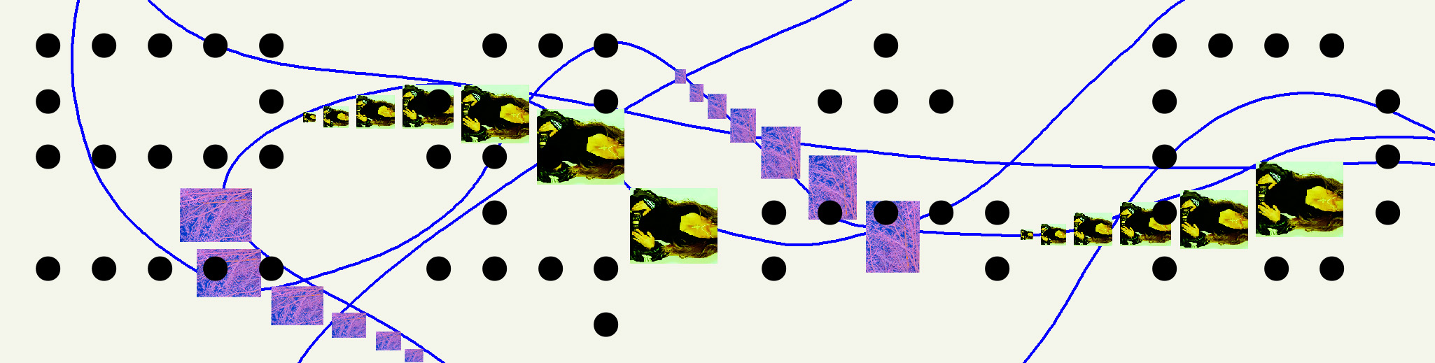
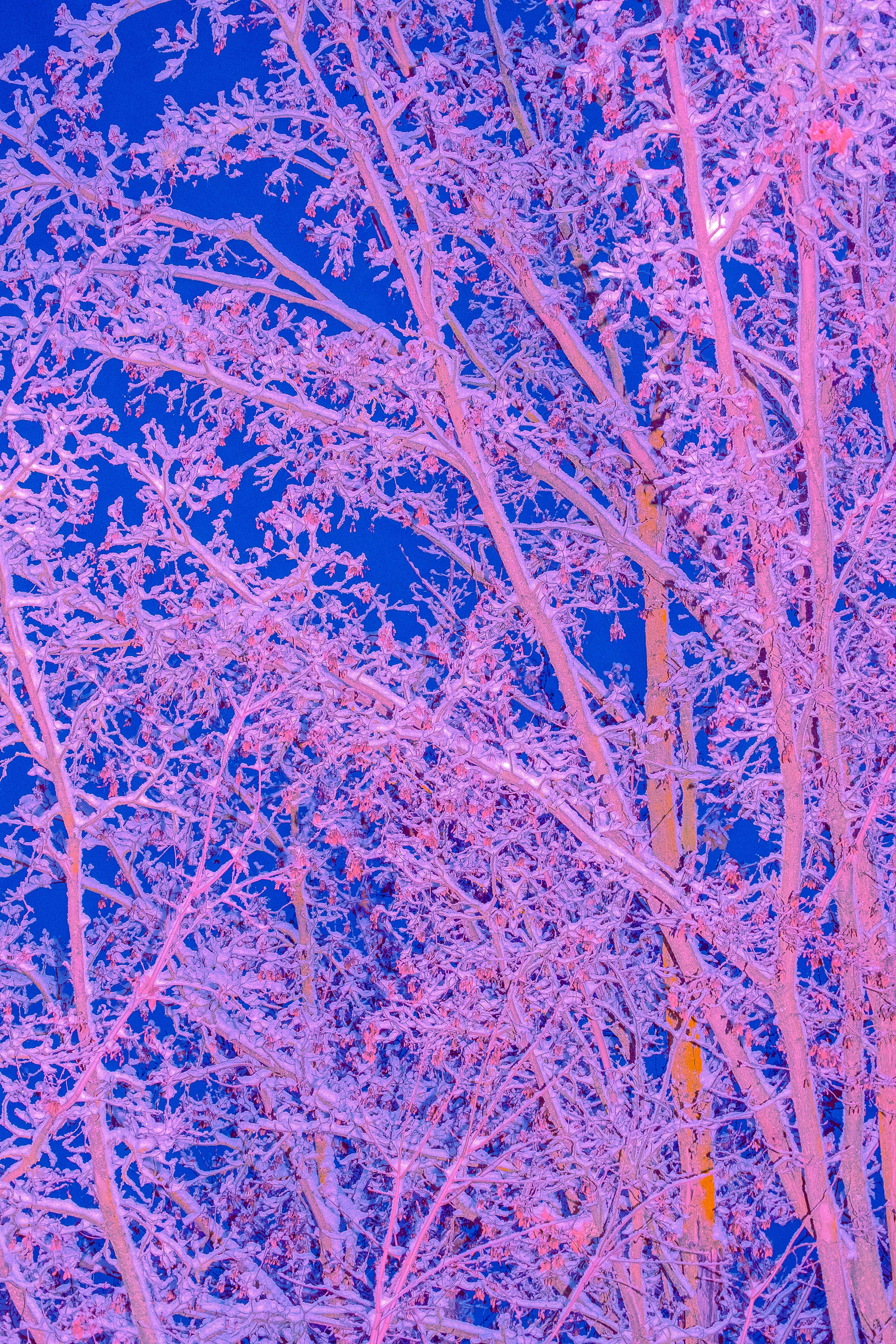
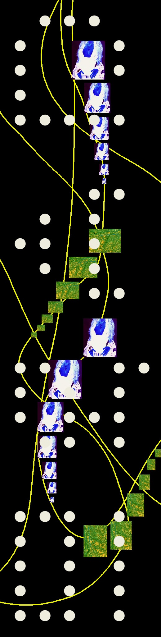
This speculative system was designed to operate as an interchangeable graphic toolkit. Typography, symbols, photography and texture can shift in scale, collide, distort and overlap while maintaining a recognizable point of view. The looseness allows each application to feel individual without losing the larger identity.
Deck & Tee Series
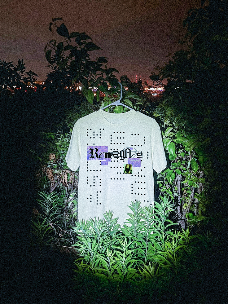
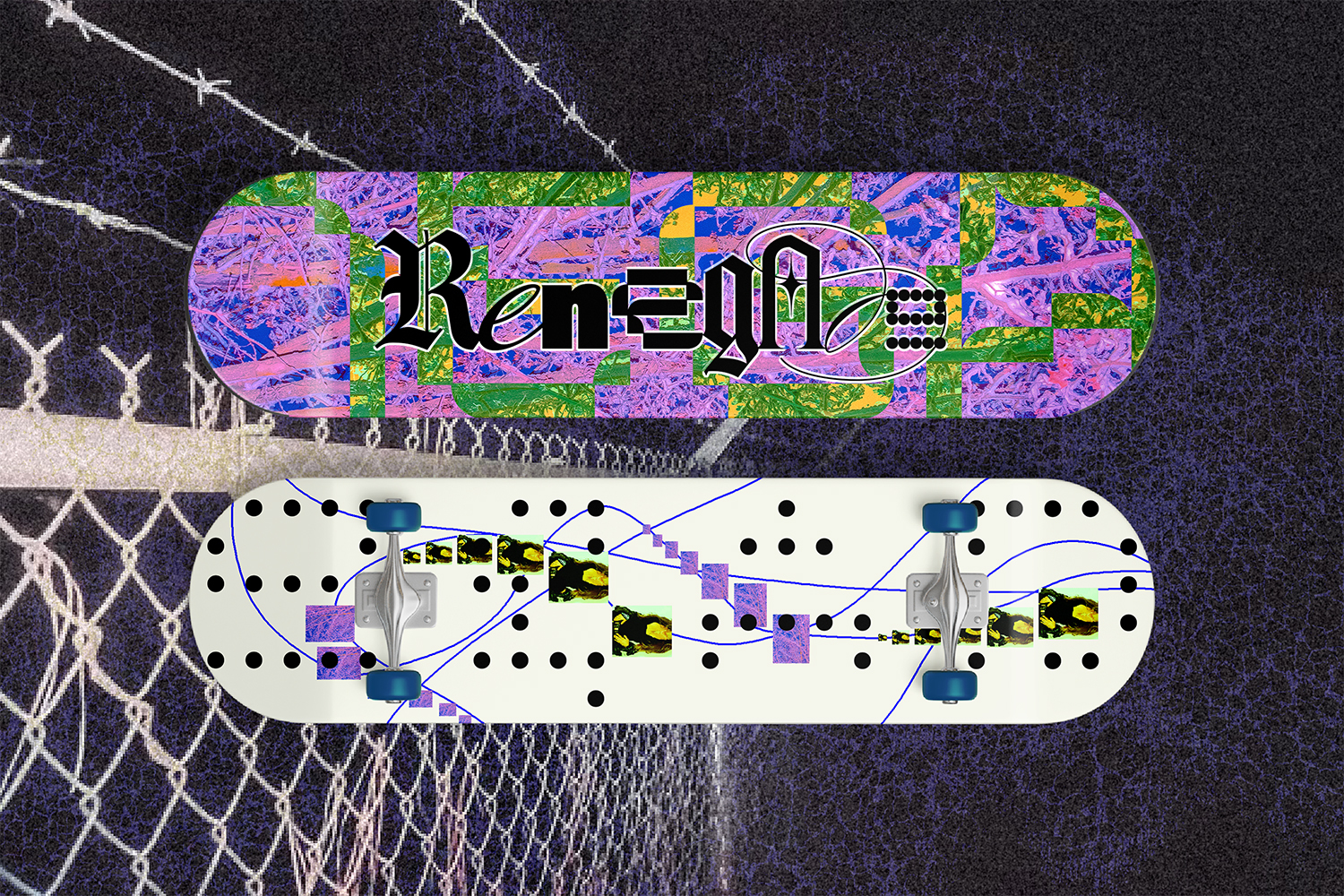
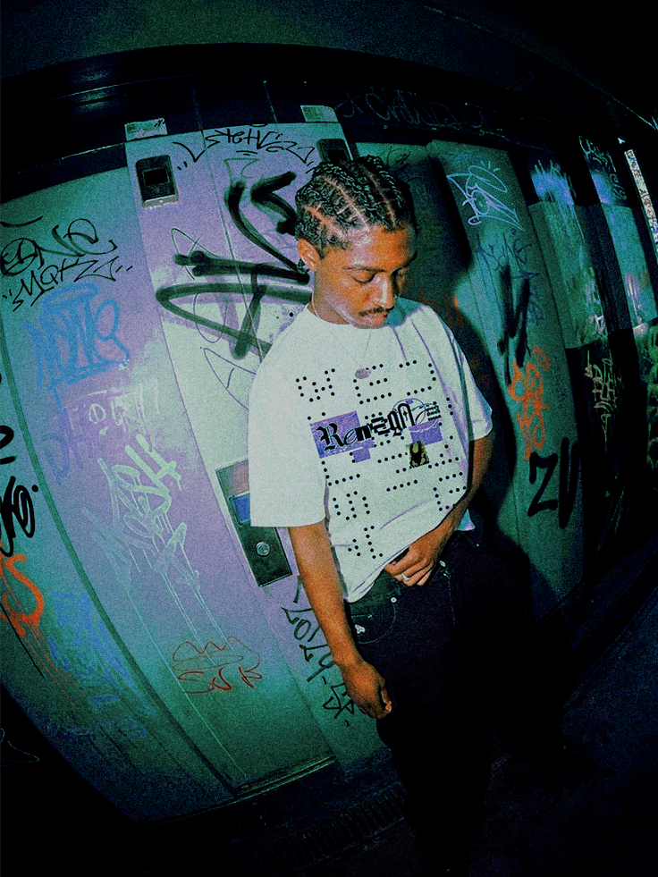
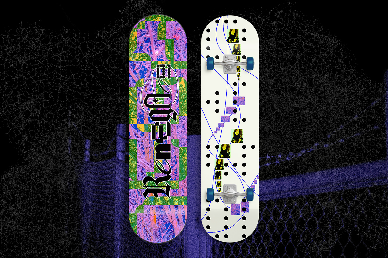
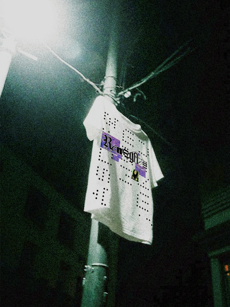
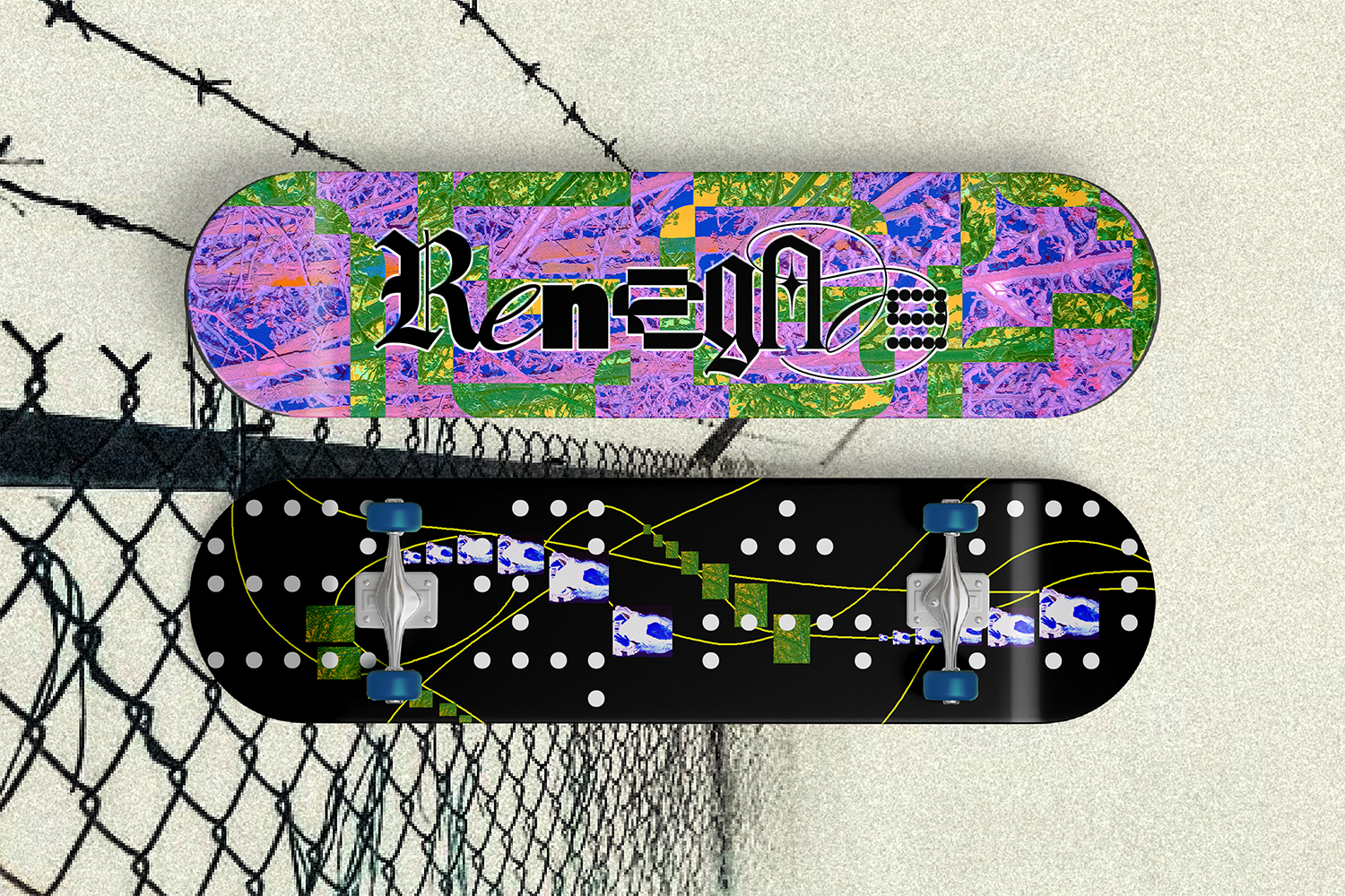
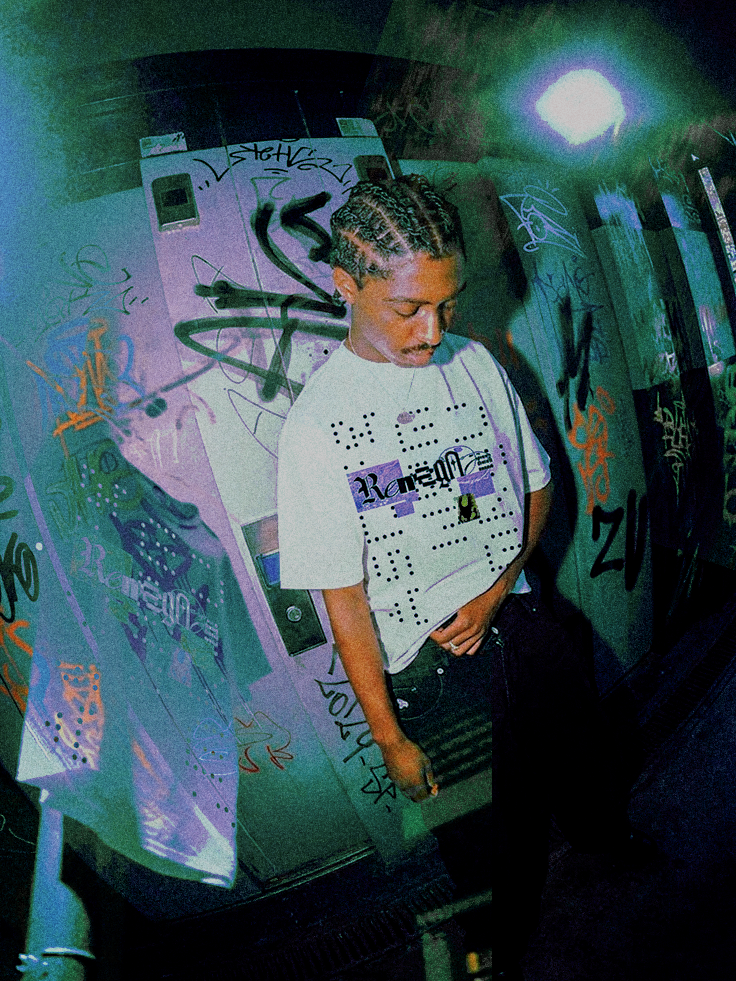
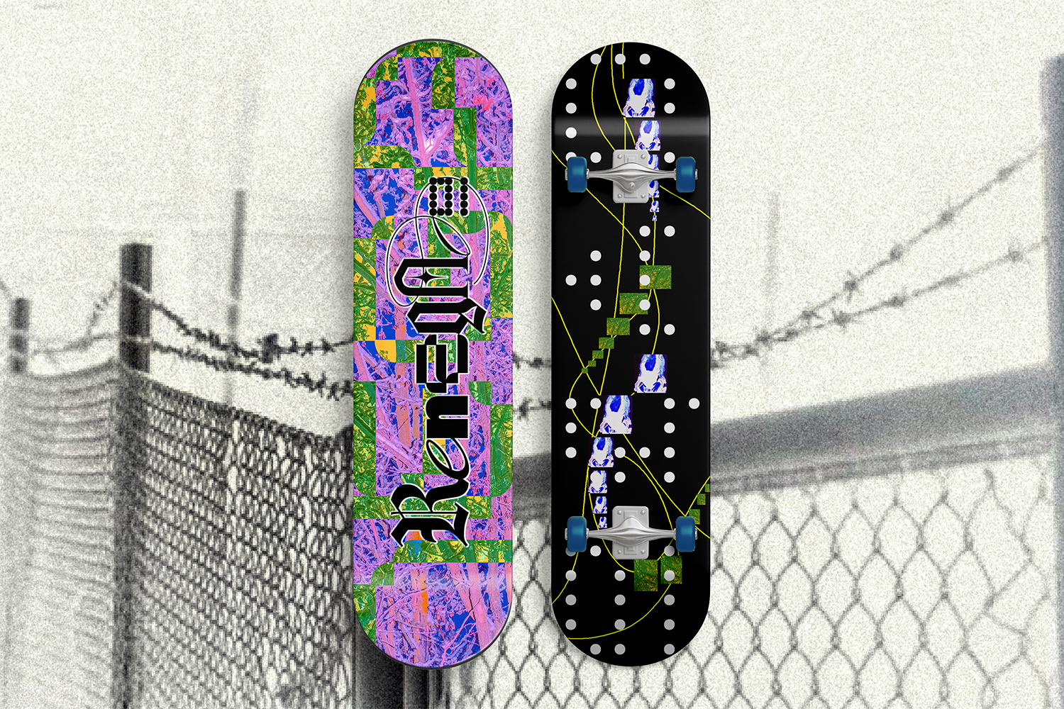
The skateboard deck and tee series became the primary canvas for the system, intended in the fictitious brand world to be included together with the purchase of a deck alone, as a promotional sale.
Each deck composition creates subtle variation across the collection, all while maintaining enough uniformity to keep the series connected.
The Outcome
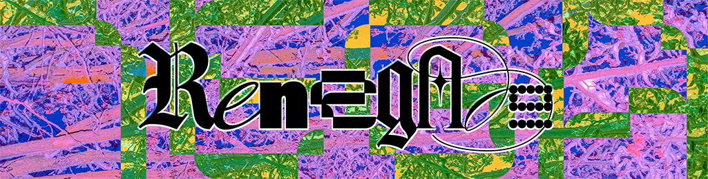
Renegade became an exercise in building a brand through variation rather than consistency for consistency’s sake.
The final system is designed to evolve across decks, apparel, campaign imagery and physical brand touchpoints without becoming overly controlled.



Deliverables
- Speculative Brand concept + positioning
- Visual identity
- Typography system
- Graphic language
- Skateboard deck graphics
- Tee shirt graphics
- Art direction
- Product applications

.jpg)
.jpg)
.jpg)